So it looks like my old blog theme just went crazy and exploded in two thousand pieces..
I’m going back to the standard one just for the sake of accessibility..
I’ll try to fix it ASAP!
So it looks like my old blog theme just went crazy and exploded in two thousand pieces..
I’m going back to the standard one just for the sake of accessibility..
I’ll try to fix it ASAP!
UPDATE: I added the lines to recognize Android, iPod Touch and Palm WebOS!
Chris, a reader of this website (and a cool photographer, check his website Intelligent Cloud), asked me how I did to setup an iPhone friendly version of ReallyJapan Photoblog and automatically redirect the users with an iPhone to this website.
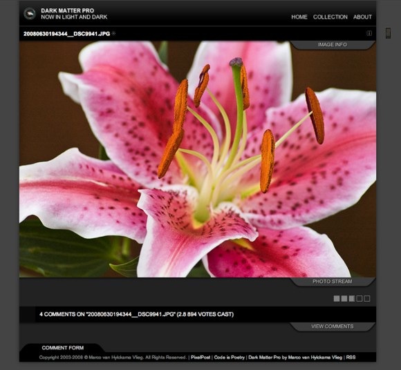
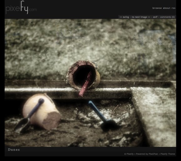
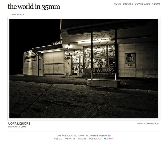
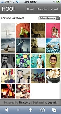
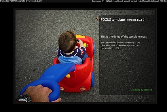
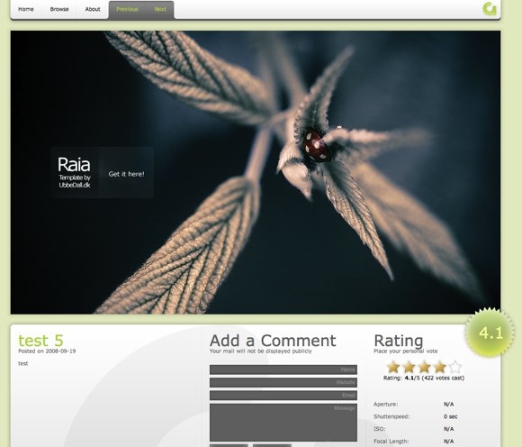
As you know, ReallyJapan is using Pixelpost, a free photo blog application. Pixelpost has many great templates, and one of them, Hoo is an iPhone optimized template.
The problem is that in Pixelpost control panel you can select only one template, and there’s no option to specify one template for certain users and a different one for the others.
So, while the Hoo template is a great solution for iPhone users, if you configure Pixelpost to use this template, all your users will see the Hoo template, no matter if they’re using iPhone, Internet Explorer, Firefox or a cyberdeck Ono-Sendai (in that case they’ll probably just look to the code).
So, what do we need to do?
Simple: When someone visits our Pixelpost photoblog, check if they’re using iPhone, and just in that case tell Pixelpost to use Hoo template instead of the one we selected in the control panel.
It requires some changes in a php file, but it’s very simple. Let’s start:
B. Now Search the file for this text: // get config
You’ll find this code:
// get config
if($cfgrow = sql_array(“SELECT * FROM “.$pixelpost_db_prefix.”config”))
{
$upload_dir = $cfgrow['imagepath'];
}else{
$extra_message= “Coming Soon. Not Installed Yet. Cause #1″;
show_splash($extra_message,”templates”);
}
What does it do? Ok, basically it’s reading the configuration of your Pixelpost installation from the database (you know all the stuff you selected in Pixelpost control panel like paths, name of the blog and.. the template).
The first case of the IF statement means Pixelpost has been installed while the ELSE case means (as you can see in the extra_message) that.. well, it’s not installed yet.
So, let’s add some code here (blue text):
// get config
if($cfgrow = sql_array(“SELECT * FROM “.$pixelpost_db_prefix.”config”))
{
$template_dir=”hoo”;
}else{
$template_dir=$cfgrow['template'];
}
$upload_dir = $cfgrow['imagepath'];
}else{
$extra_message= “Coming Soon. Not Installed Yet. Cause #1″;
show_splash($extra_message,”templates”);
}
Basically: If Pixelpost has been installed (IF case 1), check if the user agent of the visitor is iPhone, iPod, Android or webOS.
In that case set $template_dir to ‘hoo’ (the hoo template, in the folder /template/hoo on your webhosting).
Otherwise set $template_dir to $cfgrow['template'] (the default template you selected on Pixelpost control panel).
C. Save the file and..
That’s it!
From now on the iPhone users will see the Hoo template while all the other users will see the default template.
If you have any question please write a comment!
What’s great about Pixelpost is the wide selection of templates and addons available.. and if you’re not satisfied, creating a new cool template or a useful addon is relatively easy.
So, let’s take a look to the best Pixelpost templates out there.
Dark Matter
Dark Matter is a great theme with some cool fancy Ajax animations and a carousel effect to browse your photos.
You can find a Free version of this template and a Pro version with various extras (it’s $49.95). And yes, ReallyJapan is using a customized version of the free version.

Free version Demo
Pro version Demo
Dark Matter’s Home Page
Download Dark Matter
Switchy
Switchy is an interesting template that changes its layout according to the orientation of the photo.
The layout is very clean and easy to customize.
![]()
Check the demo here
Download Switchy
Pixelfy
Very clean and simple layout that let’s your photograph speek for it self. It wraps around both big and small images.

Check the demo here
Download Pixelfy
Delicious
Delicious is a fresh and tastey photoblogging template for Pixelpost. It’s a very nice theme and I’ve used it for the first version of ReallyJapan.com.

Check the demo here
Download the updated version by Andrew here
The World in 35mm
An extremely clean, modern and simple template for pixelpost you’re going to love, I do. One of the best IMO.
Try the demo here
Download from here
Pixelution
If you want a template with an unusual layout and some interesting features, check this out.
![]()
Check the demo here
Download Pixelution
Hoo! (Pixelpost template for iPhone)
Well, have you ever visited ReallyJapan.com using your iPhone? Well, you should, because it uses this template to offer you an iPhone customized version.
Now, you need to mess a little with php and your pixelpost installation to have the browser detect if you’re using an iPhone or a regular browser and switch the template… It’s not hard, but it’s not extremely easy.. I did it and maybe, if someone is interested, I could write a small tutorial on how to use this template in the future..

Focus
A simple, dark and clean template.

Check the demo here
Download Focus
Photographer’s Template
A template geared more towards a self promotional site for photographers.

Try the demo here
Download the template
Raia
A very nice template with a new, fresh web2.0 look.
Introduction
I’ve started Really Japan Photo Blog and uploaded the very first photo about one year ago.
At the beginning I wasn’t very sure to be able to update the photo blog often, it was not the first time I was starting a blog, but all the previous attempts ended up with failure, after few months.
Fortunately that has not been the case of ReallyJapan.
A lot has happened in this year of ReallyJapan. I’ve learnt many things on photography, met many great photographers, looked at some incredible shots on the web.. and I think if I didn’t start photoblogging, I would have lost many opportunities.
So, after 1 year of photoblogging, I thought it would be cool to write some kind of Guide to Photoblogging.
But, I’m going to tell you a secret: I’m not an amazing photographer or a super blogger, my website is not making trillions of visitors neither, so don’t have huge expectations..
Anyway, I hope this Guide will help all of you who are considering to open a photo blog!
What is a photoblog?
A photoblog (a.k.a. photolog or phlog) is a form of photo sharing and publishing in the format of a blog, but differentiated by the predominant use of and focus on photographs rather than text.
Why photoblogging?
There could be many reasons to start your own photoblog. You may want to show your amazing works to people from all around the world, and consequently make a lot of money with advertising & sales of your photography. Honestly, in that case you’re going to have rough times ahead, good luck.
But if your demands are a little more modest, there are many positive points on opening a photo blog.
Top Advantages of starting a Photo Blog
So.. the list could go on forever, but for this introduction I’m going to stop here.
What should you expect from the next articles of Guide to Photo Blog? Well, something like this:
Joan Charmant is a software engineer who started playing with photo manipulations in 2004, when one day he stumbled upon some UFO pictures and wanted to see how hard it would have been to fake them.
He started spending some days and nights on the website Worth1000.com (there are many great tutorials and competition on photo manipulation in that website, give it a look) and learnt a lot from the other members.
Anyway, his photoshop skills are great and his creative process pretty interesting.. just pity that his day job is software engineer so you can’t find many pics from him on the net (or twitter accounts, blogs, flickr and so on)
I really like his photo manipulations, and you?

Materials used in this picture:


material used in this picture:


material used in this picture:


fantastic materials used in this picture

Source:
An interview with Joan Charmant by Abduzeedo
Joan Charmant home page
A slightly HDR-esque set of Lightroom presets to enhance your photos.
The presets work better on images with many details and textures, also be aware that the effect is very strong, especially around the edges. You should probably adjust the fill light and restore values if you see some artifacts on the image.
Anyway, have fun with this preset!
How to install presets on Lightroom?
Click on Preferences, select Presets tab and click on Show Lightroom Presets Folder… button.Uncompress the ZIP file, move the folder in the Lightroom Presets Folder/Develop Presets and relaunch Lightroom.
Wandering around my neighborhood I found a battery vending machine. You know, where you put money and you can automatically buy some batteries. Ordinary things, here in Japan. So I started wondering, what kind of vending machines do exist here in Japan, the homeland of vending machines?
Well, this is a list of the most interesting (from PhotoMann.com)

Battery Vending Machine

Drinks & Cigarettes

Mobile Photo Recharger

Toilet Paper

Little toys for kids (and sometimes for me too)

Ice Cream

Flowers…

Photo printing!

Hot snack (french fries and hot dogs too)

The booze!

The egg vending machine!

Fridge locker

Dry ice

Rice!

Fishing baits

Kerosene

Porn magazines

Umbrella

Energy drinks & Condoms!

Noodles

Insects

Newspapers

Xrated dvds

and.. Used Panties!
Check PhotoMann.com for more infos.. that website is great!
Check out the winners of the CG CHALLENGE XXII by CGSOCIETY, themed Steampunk (you know I like steampunk, right?), Video & Image category.

Artist comments: “Our piece was inspired by the legend of the Golem, telling the story of Rabbi Loew, who created an animated being entirely from inanimate matter to defend the Prague ghetto and we decided to produce a trailer out of it for the CGChallenge.”
Judge’s comments:
Anthony Lucas: Epic. Masterful technical achievement.
Simon Dominic: I feel like I just stepped out of the cinema.
Philip Straub: Outfreakinstanding!
Michael Dashow: The composting and editing were really impressive. Lovely opening shot!
Launch the video : ‘EMET’ VIDEO page

Artist comments: ‘Working on the project was quite hard, because actually none of us had enough time for it. But we took the time besides our other projects, because this was lots of fun and really worth it. The idea and story changed many times. To get the project ready in time we worked day and night in the last week, and really: “day and night”.’
Judge’s comments
Anthony Lucas: Some great design. Good idea. Where the animation is patchy the concept makes up for it.
Simon Dominic: Wow, this is slick, with a brilliantly conceived theme too.
Philip Straub: Extremely professional on every level. Top marks from me.
Michael Dashow: Beautiful rendering, design, and camerawork.
Launch the video: ‘Atlantis – Inconvenient Truth’ VIDEO
Individual Video Master Award ‘Hemlock’
Tyson Ibele (ivanisavich)
NEW ZEALAND
Artist comments: This year’s contest was a lot of fun, especially since the competition was very close due to the large number of high-quality entries. I felt very inspired the whole way through watching other peoples’ progress, and that’s what kept me driven to finish my entry on time. This challenge theme allowed for a lot of creativity, and since I’ve wanted to do a film set in the steampunk universe for a while now, it was a perfect motivator. Thanks to everyone who offered me encouragement and critique during the production of Hemlock, and congrats to the other winners and entrants!
Judge’s comments
Anthony Lucas: Great execution. Fantastic mood. Is the steampunk robot a victim of the well? Marvellously animated.
Simon Dominic: What a great story with superb delivery.
Michael Dashow: What a great mood set throughout the entire piece. The lighting, camera-work, and sound were wonderfully effective, and the ending was terrific. Easily the most thoroughly-executed story of the bunch. Great work overall!
Grzegorz Jonkajtys: Great storytelling and directing skills, not to mention excellent lighting and animation.
Launch the video: ‘Hemlock’ VIDEO
Individual Video Excellence Award ‘Ulysses’ Dreams’
Marc Mordelet (visionmaster2)
FRANCE
Artists comments: “I had a great fun testing some shots I had in mind, and this challenge gave me the opportunity to question myself about my work process. Especially after I submitted my video, when i saw the works of the other people (especially Tyson Ibele), and after a long discussion with a friend, this evidence came to me : I need to step up to the next level, and make a short movie.”
Judges comments:
Anthony Lucas: Fantastic concept, modeling and lighting. Great design and animation. Great stuff!
Simon Dominic: Completely mental, I LOVE it!
Philip Straub: A unique, bizarre, and creative vision.
Michael Dashow: I loved the clever use of fonts in the robot’s body – very stylish (as was the rest of this film.)
Launch the video: ‘Ulysses’ Dreams’ VIDEO
Image (Individual) Master Award
‘Steamnocchio’
Fabricio Moraes (fabmoraes)
BRAZIL
Artist comments: “WOOOOOOW!!! I CAN’T BELIEVE IT!!!! I felt so great and could never imagine I could possibly win this competition, actually I still can’t believe it. I got inspired by so many great artists, and I was very well supported by my wife, family and friends. I am very excited, really!Sorry if words are missing, but is so difficult to describe how great I am feeling now.”
Judge’s comments:
Brajan: I love this one, the expression on Geppettos’s face is priceless
Excellent steampunk image!
Leigh: This image just totally nails the steampunk theme. The technical quality is simply fantastic too.
Image Excellence Award ‘BaktoFairy’
‘
Laurent Pierlot (sato)
USA
Artist comments: “It is a great honor for me to get the Excellence prize, especially considering the quality of the works that have been submitted for the contest.When I saw that the subject for the contest was Steampunk, I just couldn’t help myself. I really appreciated the feedbacks I got in the WIP forum.It was really hard for me to finish that picture, I’m working full time so it was only possible with the patience of my family on the weekends and late nights.”
Judge’s comments:
Brajan: this image looks great even as as a thumbnail. Excellent design for a creepy steampunk setting!
Oh, and check out the special category winners too!
[From CGSociety News Archive]
I thought it would be cool to show you step by step how I created the image Steampunk Cyborgs in Hong Kong.
Basically it was quite simple and quick to make, since I’ve not used 3D renderings, it took about 2 hours.

Ok, here it is, let’s start!
(If you are interested, there’s a video version too!)

This is the original picture, I just adjusted the colors in Adobe Lightroom.
Step 1

I searched on Internet for a ‘ship engine’, and I found this steampunkish thing. Actually, at the beginning I wasn’t too sure to create steampunk cyborgs (I was more a cyberpunk man, let’s say..), but as soon as I found this image I decided to go in that direction. One important thing was to find images with the right perspective, since I needed to mix them with the original picture.
Anyway, I dragged the image of the engine in the document and adjusted the colors using Match Color in Photoshop.
Step 2

I moved the engine overlapping the face of the man in the middle and started working on the mask.

It takes some time to mask correctly the object. Just try to follow the lines and the shape of the object you are masking.
Step 3

Ok, another engine here..
Step 4

Now let’s work on the man on the left. The color of the engine doesn’t match the background, so I need again the Match Color.

Now it’s much better.
Step 5

It’s time to mask the object.

Here we go. I also lighten up the engine to show better the mechanical parts.
Step 6

Another engine from Internet and again, Match Color to match the object color to the background image.
Step 7

Let’s move in on the back of the man on the right. Looks like the device used by the Ghostbusters!
Step 8
Now it’s time to work on the mask.
Here we go.
Step 9

Another engine.. match color.. and let’s move it.
Step 10

Some masking..

Step 11

Yeah.. again.. Steampunkish Overkill!
Step 12

Let’s move it and do some masking..

Pretty satisfied with the masking. Now the cyborg on the left has some weird mechanical device on his head and a cool respirator!
Step 13

Let’s add some shadows below the mechanical parts to enhance the 3D volume of the objects. I created a 50% gray overlay mode layer between the background and the robotic parts and painted it with the Burn Tool.
Step 14

This time I used a black brush, very soft, on a layer (Multiply mode) in front of all the other layers and painted some shadows.
Step 15

New Layer and Command + Alt + Shift + E (I think Command is Ctrl on windows but I’m not sure) to create a snapshot flattening all the layers in a single layer. Now I applied some blur..
And masked this layer!
I used a radial gradient to mask the blurred level. I centered the gradient on the table. This help to focus the scene on the three cyborgs slightly blurring the background.
Step 16

Let’s load some dirty textures and apply them to the cyborgs (you know, steampunk cyborgs don’t like to take shower).
You can see the texture on the red jacked, the hand, and on the ghostbuster device.

Step 17

Let’s desaturate a little the image.
Step 18

Oh God photoshop crashed! Ok, just kidding. I created a layer and filled it with this color.. then I set it on Overlay Mode.
Step 19

Let’s add some contrast…
Step 20

Don’t you want some smoke in the image? So, with a brush on a new layer paint some brush (very low opacity!)
Step 20 + the dirty textures

Now let’s add the famous Dirty dusty texture I made! Remember, screen mode this time!
(oh, and another secret texture on the top of the image.. I’ll release it soon anyway)

That’s all!
If you’ve noticed some dust, hair and dirty things on my pictures, like this, this, and this, and yes this one too, well, I can tell you I don’t like so much to clean home and even my computer desktop is a mess. Besides that.. I love grain, dust and those dirty picturessss.
So, anyway, today I’m feeling extremely generous and I’ll give you some dirtness. Three textures I made, to give your photographs a dusty and analogic feeling… to turn this kind of shots:
into this..
Just place one of the texture on a layer in front of you picture using the Screen overlay mode.. adjust the levels and the opacity to adjust the effect!